Client
Hospimedia
Category
Interface
©
Upian
Industry sector
Media for the medical-social sector.
Client goals and challenges
Encourage retention and increase conversions among a demanding readership, often unfamiliar with modern web interfaces.
User goals and challenges
Facilitating reading and interaction with the content while clarifying the value of the subscription.
User journey
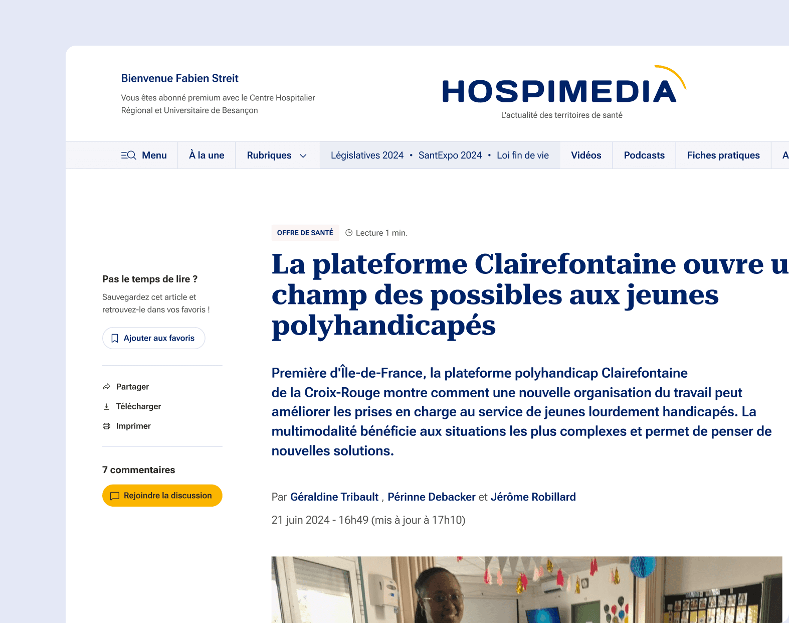
The structure of the site articulates a limited public space and a space reserved for subscribers, each with specific functions. The site offers a clear hierarchy: on one side, editorial content; on the other, features related to subscription (plans, services, personal space). The navigation is designed to guide users towards conversion without breaking the flow of reading.
Key moments and decisions
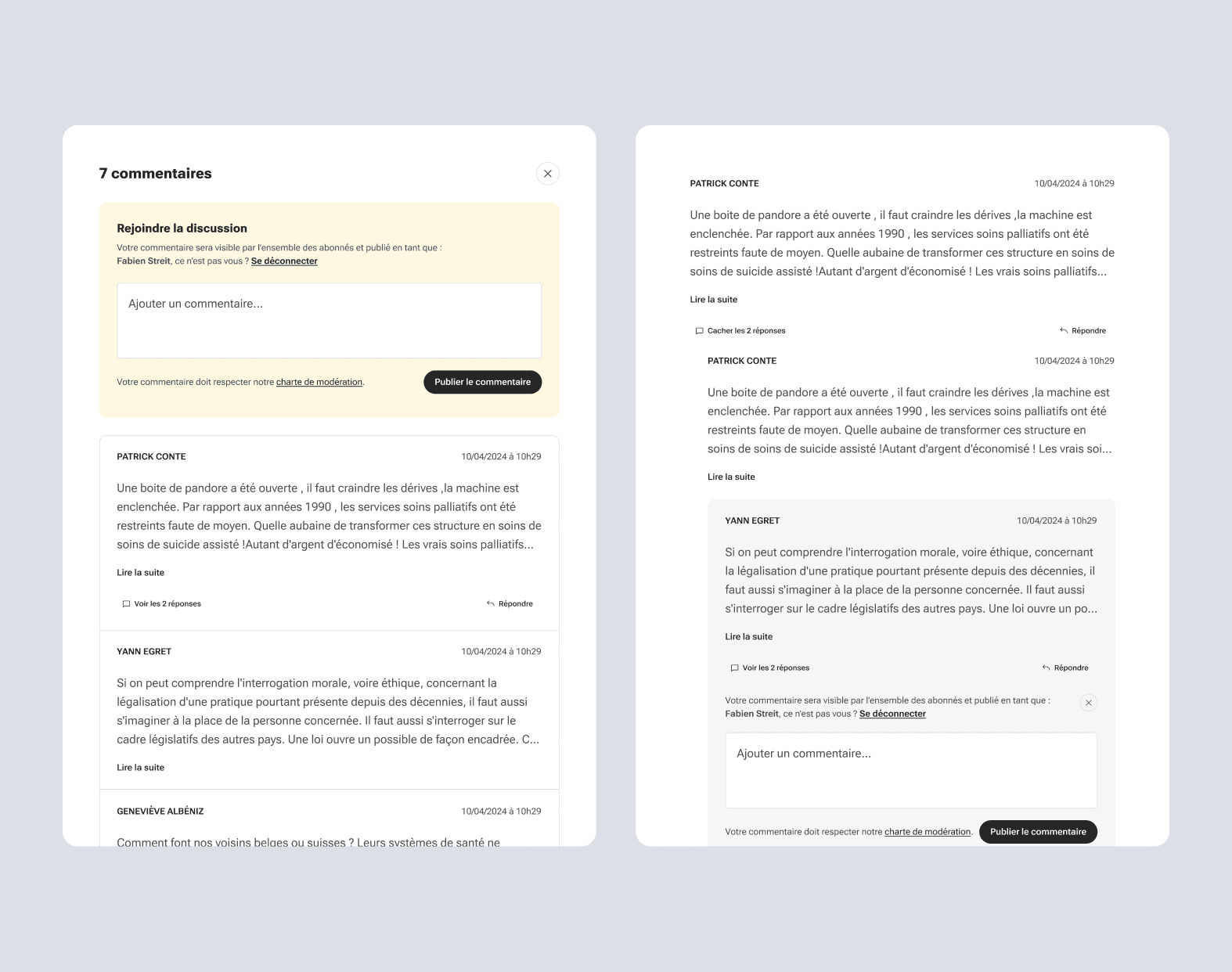
The sticky menu located on the left of an article has been designed to cater to the habits of professionals by providing direct access to actions such as printing or saving. The comments section, inspired by Medium, allows for community exchange on sensitive topics. The progressive paywall, visible after a viewport, combines a teaser of the article, marketing arguments, and clear subscription plans. The subscription landing page has been designed as a page of persuasion, with structured and reassuring storytelling.
Key features
The essential modules have been designed with real usage in mind: actions are always visible, subscription blocks are educational, and the call-to-actions are well organized. The simulation of a typical day allows users to envision their daily usage.
User tests and validation
The tests were conducted internally at the client. The architecture of the site is based on identified uses (quick reading, sharing, archiving) and aims to streamline access to the offers without breaking the editorial immersion.